Is it possible to design a fully accessible website which is also dynamic and caters to both blind and sighted users? Sight loss charity Blind Veterans UK launched an ambitious project to find out and has received a top digital accessibility award for their efforts.
When Blind Veterans UK made the decision to launch a new website, they faced the unique challenge of designing a fully accessible site from the bottom up, not only for their audience of blind and vision-impaired users who often have a range of comorbidities such as cognitive decline and hearing loss, but a sighted audience too.
In doing so they faced the age-old adage that accessible websites are boring and don’t provide a dynamic experience for users. The charity welcomed the opportunity to prove the naysayers wrong and worked with sector leaders Reason Digital to create a website that balanced accessibility, usability and engaging design.
From the get-go Blind Veterans UK rejected existing accessibility tools, instead opting to create an accessible website from the outset. In order to achieve this they consulted with the blind veterans they support through multiple rounds of checks during the design process. Given their audience’s range of sight levels, diversity of tools used to access the internet, and spectrum of comorbidities, this testing process was paramount in achieving the final outcome of producing a website that is easy to use by everyone.
Following extensive testing by accessibility experts AbilityNet, the charity received an ‘Accredited Plus’ certification, which recognises the website as not only compliant with the required technical standards of Web Content Accessibility Guidelines, but also usable in real life, proven through testing by users with a range of accessibility requirements.
Why make an accessible website?
Accessibility was the number one priority for Blind Veterans UK when they started designing and building their new website. They worked to make sure it was easy to navigate and ensure content was easily read and accessed by everyone.
They designed the website with three key audiences in mind. Firstly, vision-impaired users who are not yet receiving their support. Research showed that these users may be struggling with mental health issues and cognitive impairments and may be visiting the site using older technology.
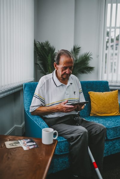
Secondly, the blind veterans they support, with an average age of 85-years-old. The needs of people with a vision impairment change as their sight loss journey progresses and the charity wanted their website to work for these users at every stage of that journey.
And finally, all users, providing the same rewarding and informative experience for those without a vision impairment, such as their supporters and those representing the charity’s beneficiaries.
The design process
The charity spoke to vision-impaired veterans, their partners, and their own staff and volunteers about their needs throughout the design process.
Some vision-impaired people use screen readers, which read everything on the screen aloud. But not all of their audience use this technology. If users have low vision rather than no vision, they might be using screen magnifiers. Magnifiers enlarge the screen, meaning much less of the screen is seen at any one time. To deal with this, Blind Veterans UK adopted a clear and simple visual design to help those using screen magnifiers.
The charity’s next consideration was that many website users are prospective beneficiaries. From their research, the charity knew that many blind veterans are in crisis before they join the charity. They are often suffering from extremely poor mental health and may be in denial about their access needs. Because of this, the charity ensured that the site has a very low cognitive load, meaning that it’s easy to process and understand
In order to do this, Blind Veterans UK opted for a clear, simple website design that was easy to interact with. By using plenty of white space and breaking up text with images and graphics, the pages don’t become overwhelming for the user.
They used clear, concise everyday language and structured pages with clearly defined sections, using headings and subheadings, to ensure that the reader can easily find the information they need.
The audit
Blind Veterans UK worked with pioneering accessibility charity AbilityNet to audit the website across desktop, mobile and tablet. During user testing, participants conducted a thorough review and provided feedback on the website using different technologies, such as screen reader, keyboard, voice recognition software and screen magnification software.
The site was tested by six users for 90 minutes each. They included participants from a diverse range of user groups including users with a vision impairment, neurodiverse users, those with hearing loss, and users with a mobility impairment.
Following feedback and rechecks Blind Veterans UK achieved a WCAG – AA rating and received AbilityNet’s top award for accessibility, Accredited Plus.
One of the people who tested the website, who has a vision impairment, said: “It’s well and thoughtfully designed, intuitive to use, and provides the information that’s needed in a concise manner. It’s easy to navigate, and all the information is where you’d expect it to be. For accessibility, definitely five out of five, no issues there at all.”
Jane Murison, Design and UX Director at Reason Digital, said:
“It’s been a huge privilege to work on a project that really lives up to its promise to prioritise accessibility and usability, putting the experience of users with access needs at the heart of our design and development.
“Beyond just adhering to guidelines, we worked directly with blind users to establish their needs, to understand their wide range of assistive technology, and to garner valuable insights to help improve our designs and prototypes.
“Blind Veterans UK beneficiaries have generously and repeatedly shared their experience, to teach us a great deal about not only what would work for them, but how we might improve our work for future projects to benefit others with access needs.”
Amy Low, Service Delivery Director at AbilityNet, said:
“Securing this accreditation is a huge achievement and the team at Blind Veterans UK approached the process with enthusiasm and a determination to ensure that their website offered the very best experience for disabled visitors. The accreditation process draws on the experiences of users as well as evaluation of the site for compliance with web content accessibility guidelines and the Blind Veterans UK team took on board the findings and worked diligently to address barriers encountered and feedback shared.”
Mark Whatham, Head of Marketing & Communications at Blind Veterans UK, said:
“As we move forwards with the website we’ll make sure we work closely with our beneficiaries to ensure that accessibility remains at the heart of everything we do. We have some exciting developments in the pipeline for a beneficiary resource area which will need to be accessible for our blind veterans who have a broad spectrum of vision impairments.
“If there’s any organisation that would like to understand more about making an online experience more accessible, we would be more than happy to talk them through our journey and what we learned along the way. Feel free to get in touch.”
Blind Veterans UK supports thousands of blind veterans across the country, but knows there are many thousands more who still need its support to rebuild their lives after sight loss.
If you, or someone you know, served in the Armed Forces, including National Service, and are now struggling with sight loss, then please get in touch. Call 0800 389 7979 or visit blindveterans.org.uk/gethelp
